Food and Beverage
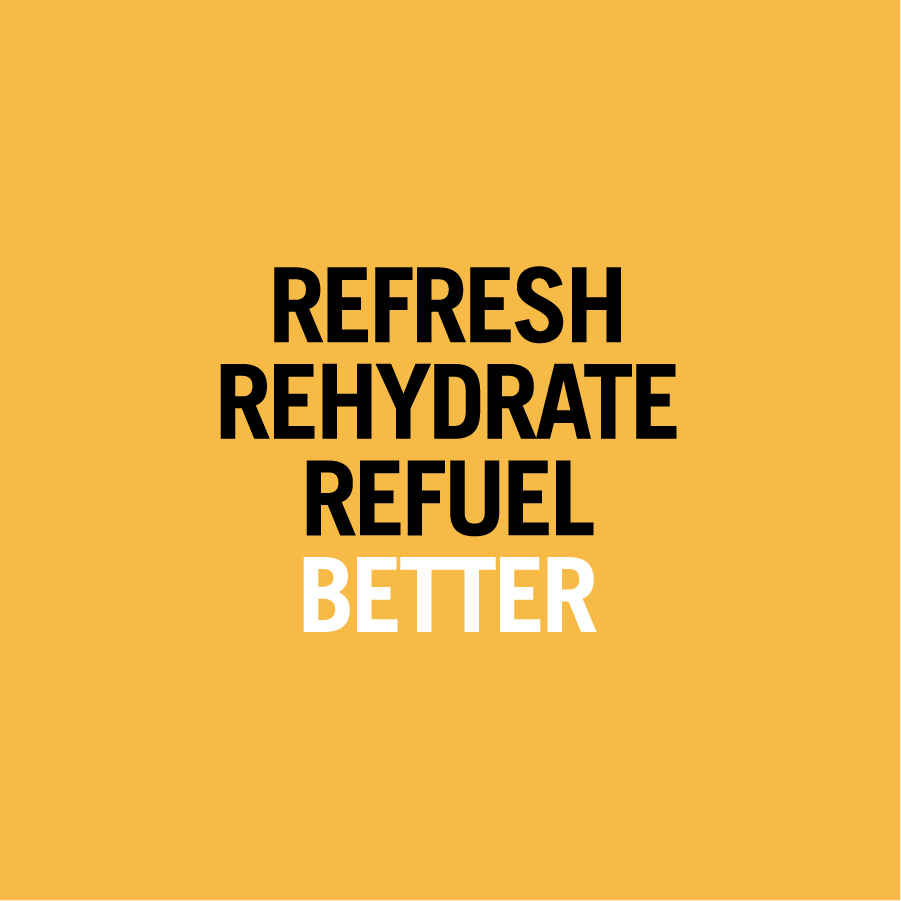
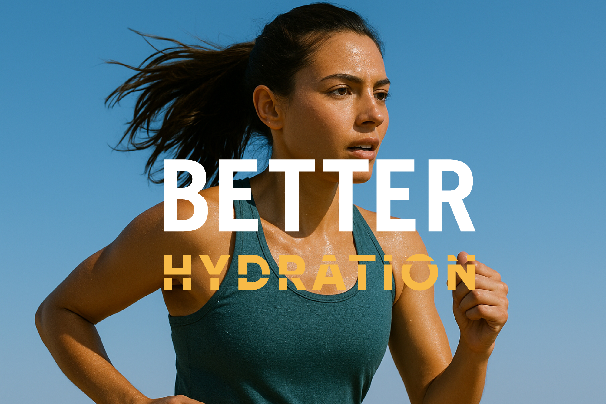
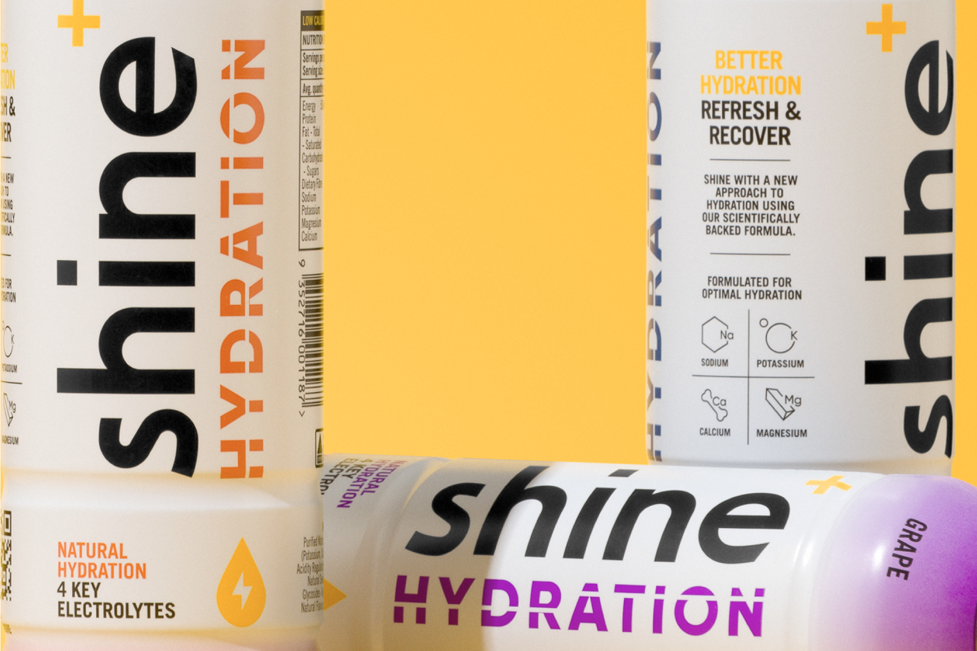
Shine wanted to introduce a new hydration line aimed at everyday performance and recovery. The design needed to appeal to people looking for hydration and refreshment on hot days, after workouts, or whenever dehydration hits.
Adding a new offering is always a balancing act.
Shine’s original Better Energy drinks target mental performance, while the new hydration line focuses on combating dehydration. Even though the functional benefit is different, the product still fits the brand’s core mission: helping people THINK, FEEL, and DO BETTER.
It made sense to build on the strength of the existing brand rather than create something entirely separate. The challenge became clear:
How do we make it unmistakably Shine, while still giving it enough distinction to live confidently in the hydration category?
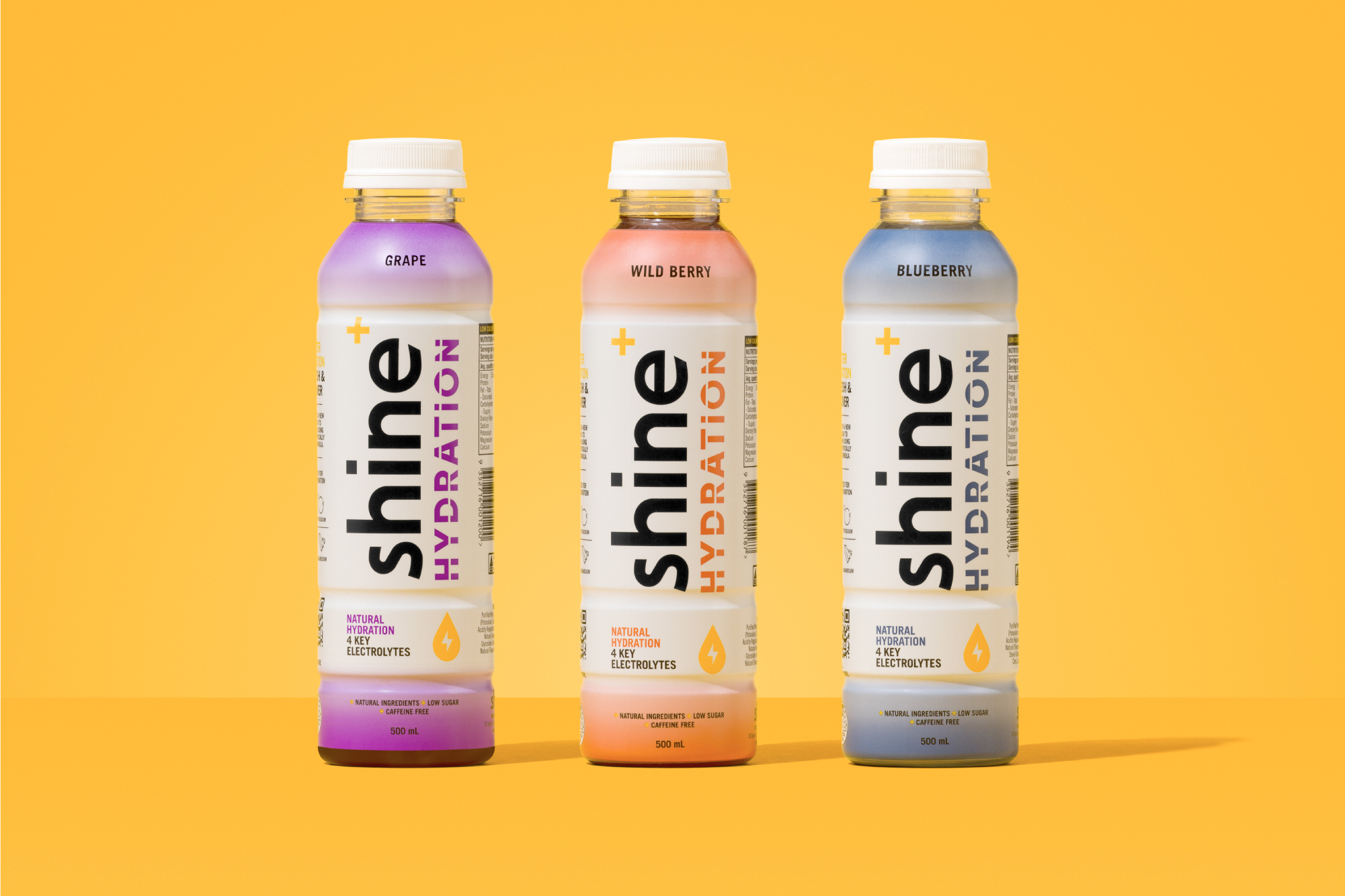
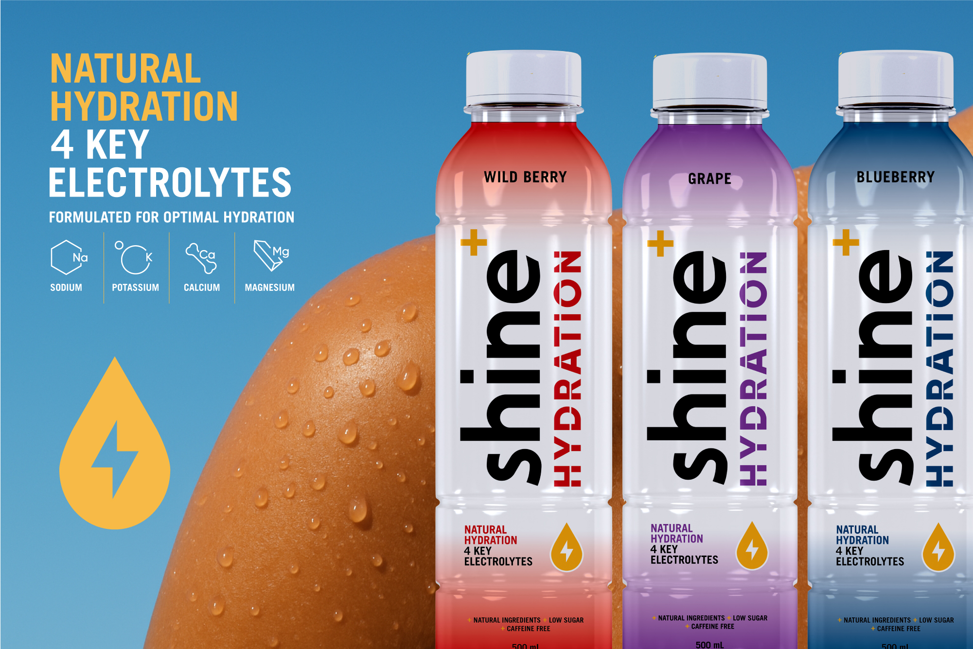
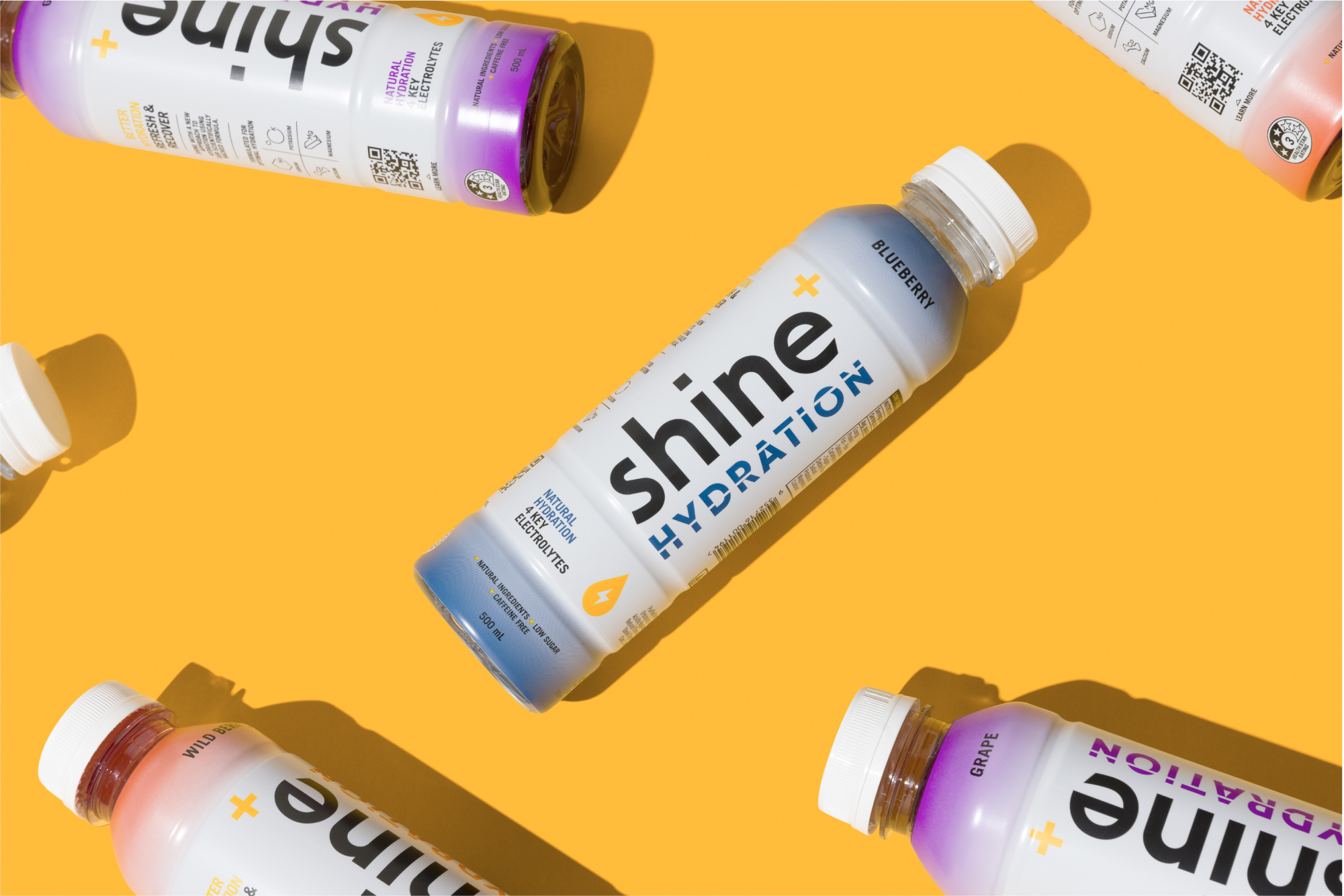
We used the design foundation created for Shine Better Energy and evolved it for the new range. The structure and hierarchy stay familiar, building brand consistency across the lineup.
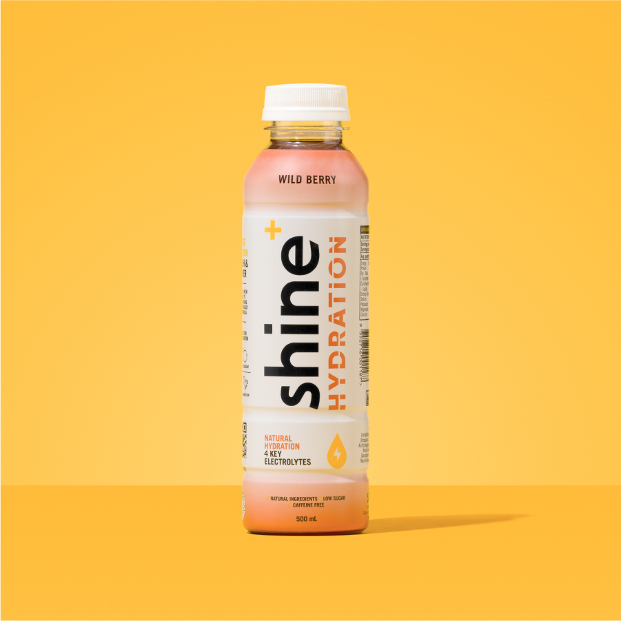
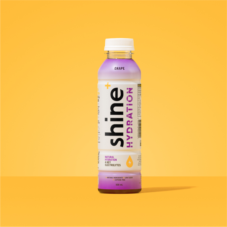
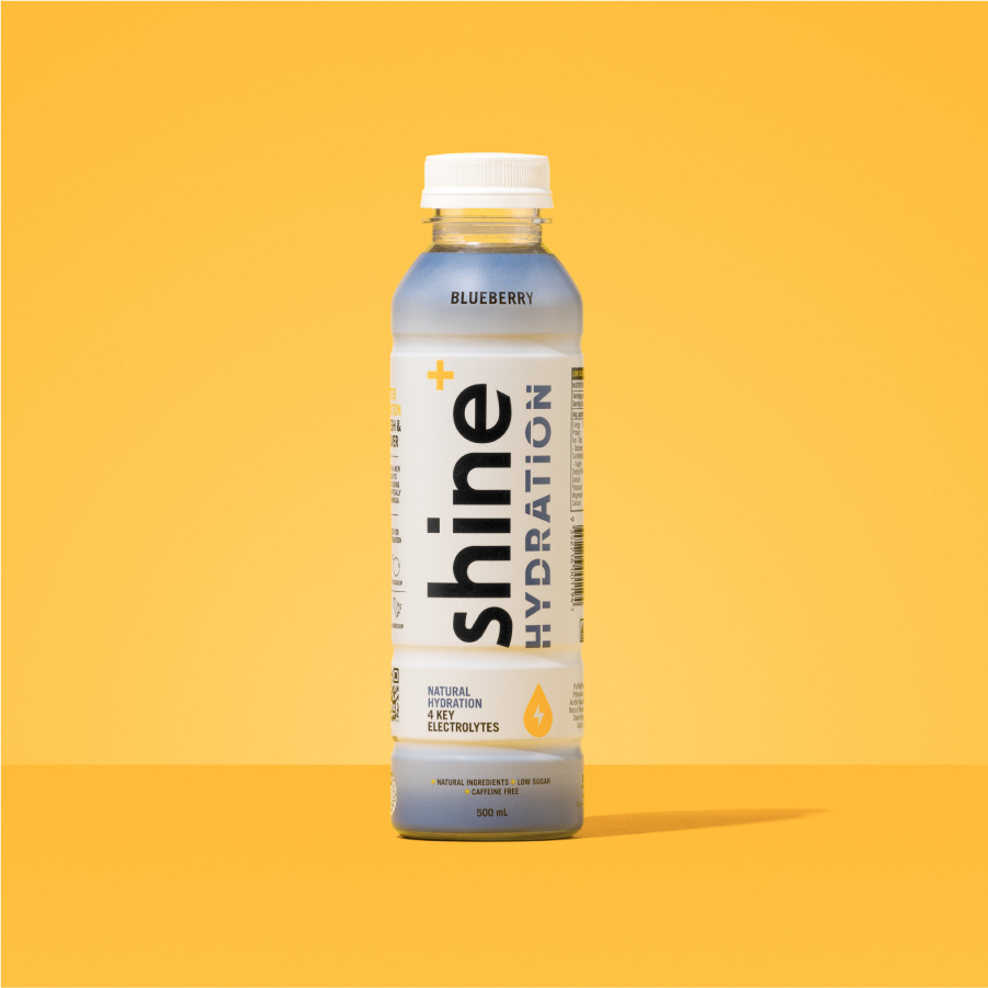
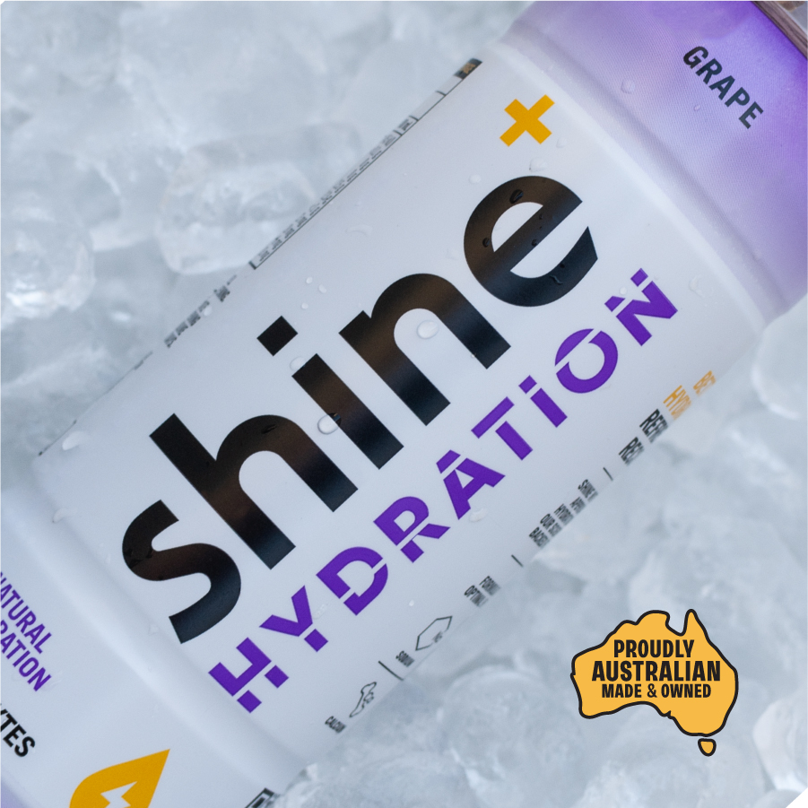
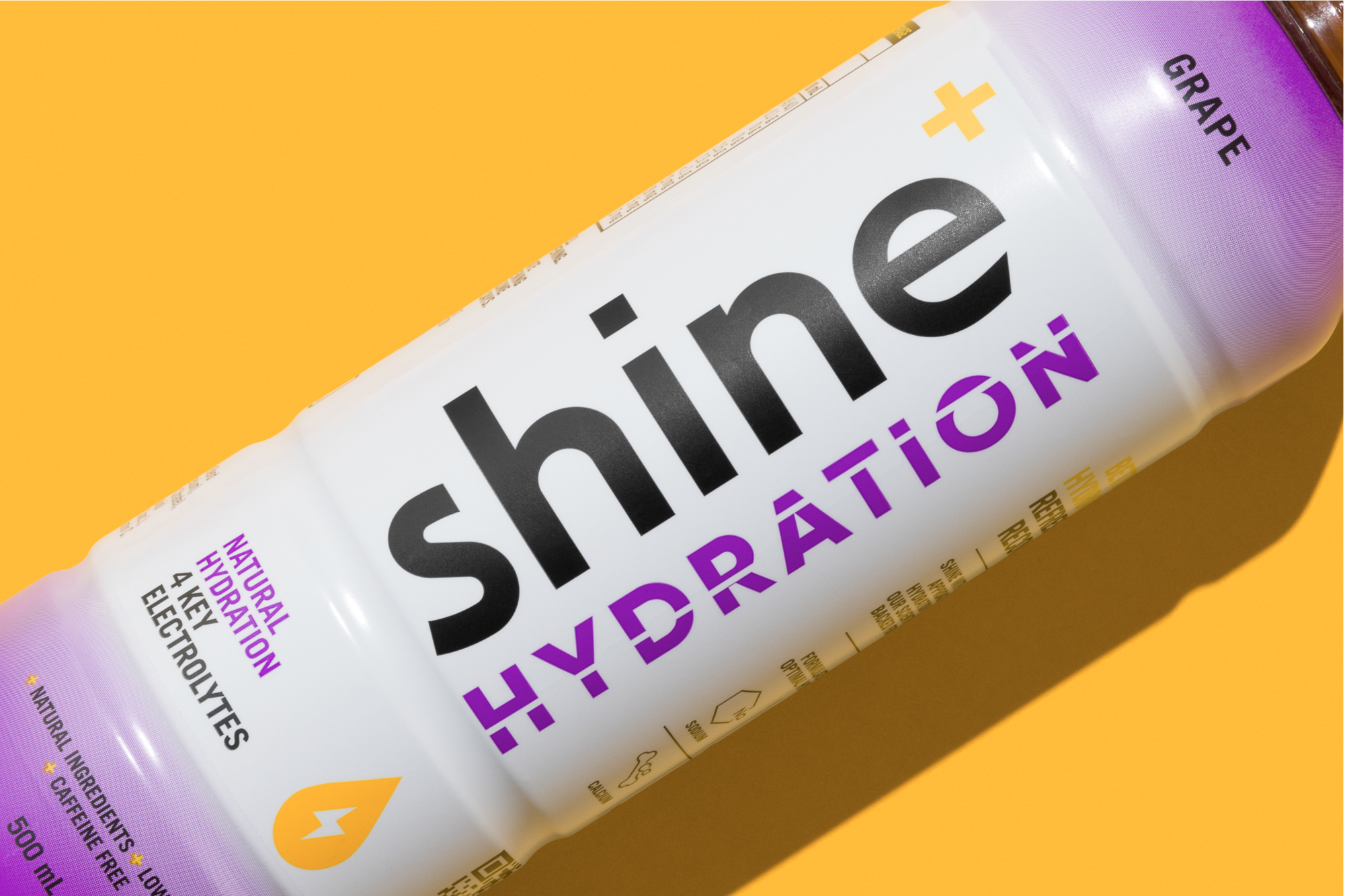
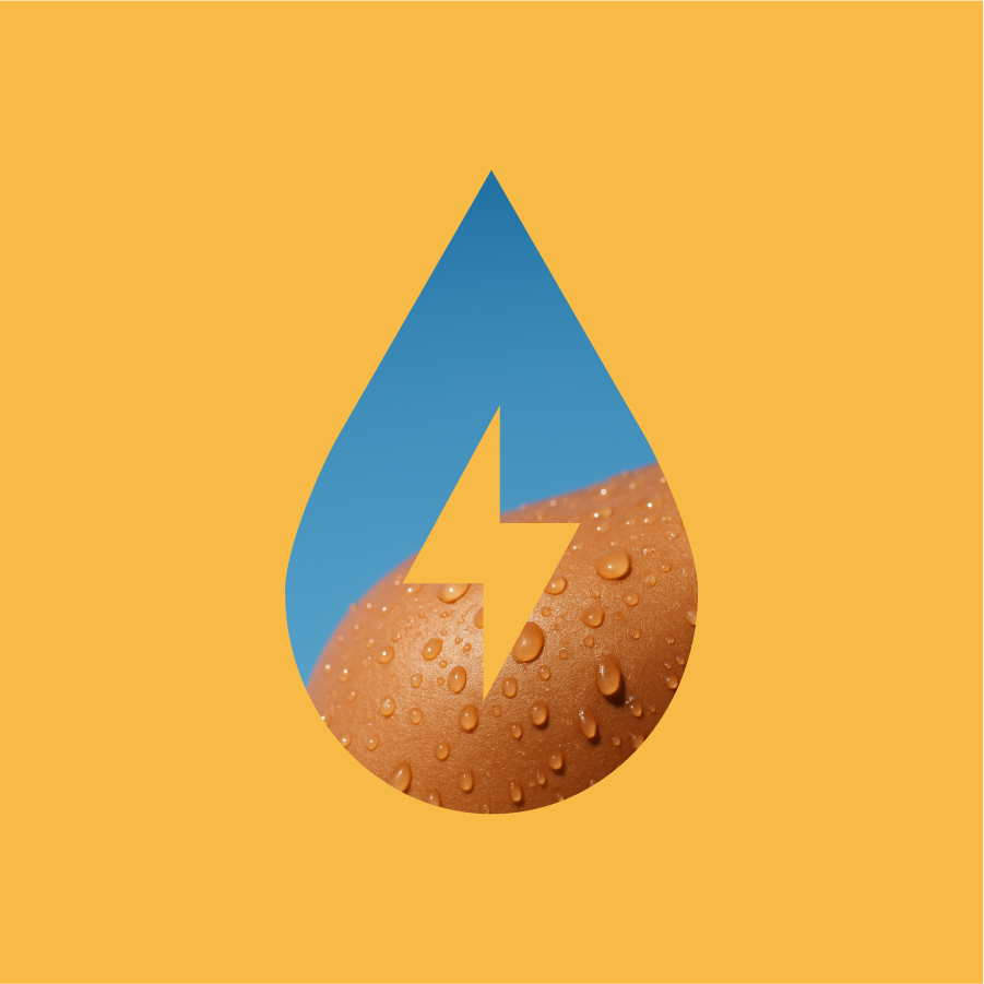
To signal “hydration” quickly and clearly, we introduced predominantly white packaging paired with a top-and-bottom colour fade. This fade cues flavour instantly while giving the product a lighter, more refreshing feel that aligns with the brief.
Shine Hydration launched in December 2024 to strong customer feedback - especially around flavour and effectiveness. The range has also secured Shine a major partnership as the official hydration partner of the Cronulla Sharks NRL and NRLW teams.

How do we make it unmistakably Shine, while still giving it enough distinction to live confidently in the hydration category?